AT&T is the third largest wireless carrier in the United States and the third largest telecommunications company in the world by revenue. The company was founded in 1876 and is headquartered in Dallas, Texas.
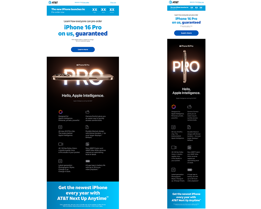
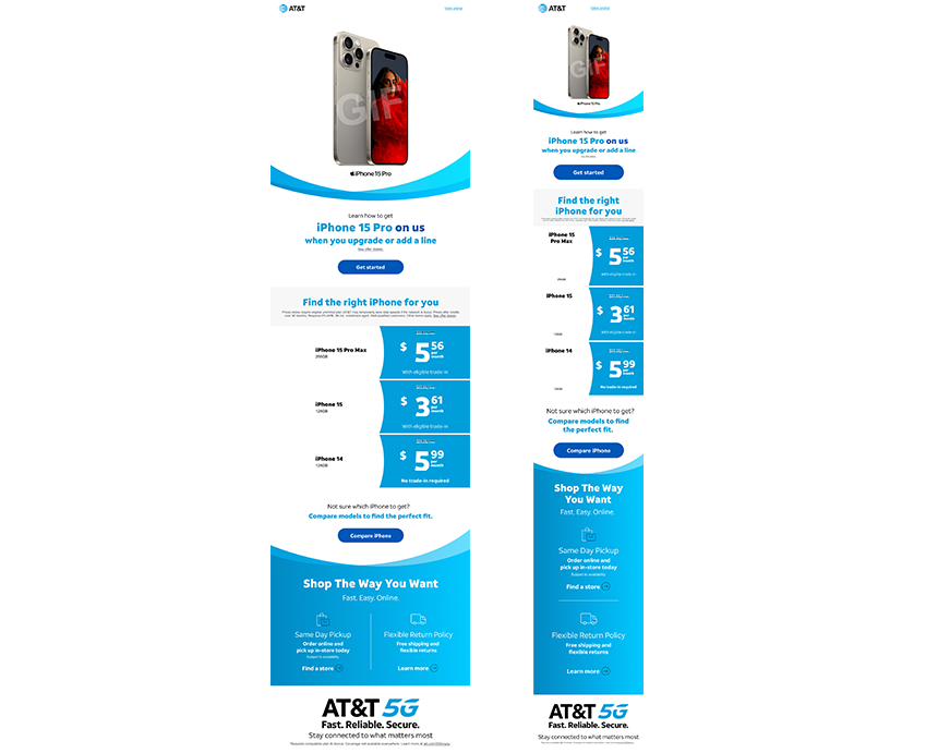
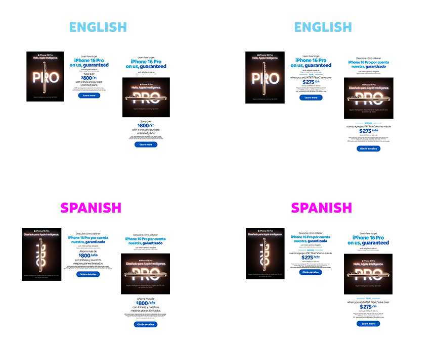
Over the past two years, I have worked on our eDM designs and recently started collaborating on improving our workflow to address issues affecting design lead times and the efficiency of developer handoffs.
Audience: Our audience includes internal teams, external vendors, developers, and over 500,000 customers who engage with our eDM marketing materials.
My Role: I led this project from research through to design, collaborating closely with external developers as well as our brand and marketing teams. My focus was on ensuring that both our brand and technical requirements were clearly defined, while maintaining a seamless and positive customer experience.
I've help an developed a unified email style guide that aligns seamlessly with AT&T's latest design system. For our visual identity, we primarily use the bold and regular weights of the Aleck Sans font family to create a consistent and recognizable look. Other weights of Aleck Sans are available for functional purposes, such as improving legibility at smaller sizes, but should not be used as the main font choices.
Our primary color palette is comprised of AT&T Blue, AT&T Black, and AT&T White. Our blue is our core color It’s a powerful signal of our brand and should be present in every communication.
created a spectrum of 6 colors, from light to dark, with AT&T Blue at its core. We call it the Agile Spectrum.
In a global marketplace, connecting with audiences from various cultures and languages is crucial for impactful branding. Writing for multiple languages in branding campaigns means more than just translation; it’s about creating messages that resonate deeply with diverse audiences. By prioritizing multilingual communication, brands demonstrate a commitment to inclusivity, fostering trust and stronger connections with a broader customer base. Culturally mindful and consistent messaging reinforces brand identity, ensuring that campaigns communicate powerfully, wherever they appear. Thoughtfully adapting language allows brands to craft campaigns that feel both locally relevant and globally cohesive.
Create a brand color scheme
We focused on enhancing navigation, search, modals, forms, and other functionalities that were malfunctioning. This included:
Visual refresh: We redesigned the tile buttons to be more visually appealing and easier to interact with by incorporating prominent visuals and clear click states.
Improved modal experience: We added a cancel icon to modals for a more user-friendly experience.
Conciseness: We condensed lengthy text into shorter, more readable pieces. Additionally, we converted long links into tile buttons to comply with CATO accessibility standards.
Our team and I created new features and service components to our product pages. This means finding the information our customers need is a breeze, and they can easily discover how these features will benefit them. Each section of our service and product pages is designed to showcase these features and the specific value they provide.
New AT&T Business site Attracted more qualified leads by showcasing AT&T Business expertise , resulting in a surge of 35% lift in digital hot leads interested in our solutions. 75% lift in organic traffic, Improved conversion rates by providing a seamless user visual experience by 125% faster page load times. Strengthen brand reputation with a modern and professional website.
We integrated benefitable components with features and services directly on our product pages. This provided several key benefits:
Frictionless Product and Service Interest: Customers can now effortlessly view products and services of interest while they continue browsing, seeking learning resources, or seeking further products.
Lead Capture & Retargeting: The learn more feature functions as a valuable lead capture mechanism. Users can be prompted to enter learn more, enabling future communication and potential retargeting communication.
Enhanced User Experience: The contact us forms by allowing seamless product information, facilitating the user's eventual contact with a sales team for potential purchase decision.
Outcome:
Strategically designed components improved user experience while simultaneously creating avenues for increased engagement, lead capture, and ultimately, higher conversion rates.